Now, let's take a deeper look into the second phase. We have talked about
selection in the first lecture and we will talk about mapping in this
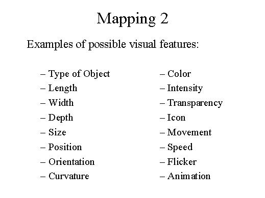
second lecture. And here are some examples of visual features you can
map on. So you can start from your raw data and map your raw data for
example into different types of objects. You can map data on points, on
lines, on volumes, on icons, many kinds of different graphical objects.
Then another typical choice is to map data on length. For example, a number
can be mapped into a line of a given length and a greater number can be
mapped on a line of greater length. So length gives an immediate distinction
about the magnitude of two different quantities. And if you have an object
on the screen, you can also change its length, but you can also change
its width. And if you change these two parameters simultaneously you are
mapping on an area, so the area is proportional to some values of your
data.
Then, if you are working in a 3-D space you can also map on depth, objects
can be closer, or can be far away, according to the value of some data.
I have mentioned the area example, but in general you can also reason
about size. For example you can have a 3-D sphere and the sphere can be
of large, of small size. Probably one of the first choices which are considered
by an IV designer is where to draw the graphical elements, so the position
of elements on the screen, and position concerns several different aspects,
because you can draw by choosing a mapping on the X-axis, Y-axis or in
3-D you can use also the Z-axis, but you can also consider for example
the position on a circular surface and many other examples of determining
the position. Then we can also map on orientation, so your object can
have a degree of orientation according to the value of variables into
a dataset, or even curvature, your object can become curved. Colour coding
is another typical choice, so you can map for example on a blue to yellow
scale. Your numbers become colours and if they are small they are blue,
if they are big they are yellow, and you have also all the colours in
between, according to the various values of your numbers. You can also
keep a single colour, maybe just blue, just yellow, or red, or anything,
and change the intensity, so you have the same colour but various intensities.
You can map on transparency, so a graphical object can be completely solid,
or become more and more transparent, according to some value, or you can
map on different icons: you can have an icon with a smiling face, to indicate
that your data are OK, an icon with a very sad face, to indicate that
your data are bad, and you can also have all the faces in between. You
can map on movement, your graphical objects can for example rotate clockwise
to indicate let's say an increasing trend, and counter-clockwise to indicate
a decreasing trend. You can map on speed, for example the speed of rotation
can be very fast or very slow, according to some variable. And you can
map also on flicker then the objects have different flickering frequencies.
And finally, animation is another typical example. You can have pollution
data recorded over a city, and this pollution data are recorded over a
week period, so all the data are time-stamped and you can animate the
data on a picture of the city, with the different clouds of pollutants
enlarging themselves or shrinking, according to evolution of time.