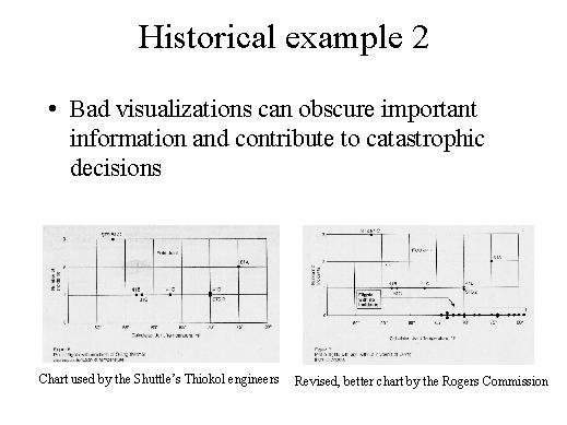
From this
point of view I have another notorious example taken from the results of
the Rogers Commission, the Commission that analysed the Shuttle, the Space
Shuttle disaster. One of the main factors that contributed to that disaster
was a bad choice in the selection process for visualising data. The engineers
that the day before the launch had to decide if the cool temperature predicted
by the weather forecast for the day of the launch could be a dangerous factor
used charts like this one. It is a scatter plot: here they had the temperature,
and here they had the number of problems that affected a specific component
of the Shuttle, called the O-rings. And these points are the various previous
Space Shuttle launches, so for example in launch n. 41/c the temperature
was about 63° Fahrenheit and there was one technical problem in the
O-rings. The chart in itself is a good choice, the problem that contributed
to the bad use of this chart was a selection problem, because the engineers
who had to decide reasoned like this, they said: "OK, we are interested
in problems, so let's filter out all the Shuttle launches where everything
was OK, so we draw just the Shuttle launches which had problems, and we
filter out the other data". The result was this chart and by looking
at this chart they concluded that temperature was not a so relevant factor
for the fault in O-rings because they said "OK, in this launch it was
cold and there were three problems with O-rings but here it was hot and
there were two problems and so there is not so much difference". And
in the official conclusions of the Rogers Commission, it is explicitly said
that they should not have filtered out the Space Shuttle launches which
were OK, but they should have included those launches in the scatter plot
because if you take a look at the revised scatter plot where the good, the
OK launches are not filtered out you will come to a very different conclusion.
Here you have all the OK launches and you can notice that when the temperature
is hot the problems are very rare, and when it is cold problems are very
common.
So I will conclude with this example and in my next lectures I will deal
with the other phases of IV design. For each of these phases we will see
that there are some principles, there are some design indications you should
be aware of to avoid errors that contribute to bad visualization and take
you to the wrong decisions.
| 
|