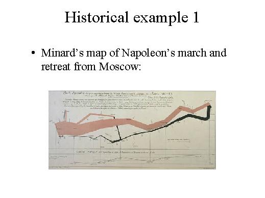
Here is a very popular IV example, an example that comes from the 19th century, from the cartographer Minard, who designed this visualization to give a quick and easy to understand idea of a number of data concerning the war of Napoleon, the march and retreat of Napoleon's army towards and back from Moscow. What Minard did was to draw some lines of varying thickness on a geographical map, a very simplified geographical map, that - as you can see - mainly represented rivers and some geographical locations. This line is the path that Napoleon's army followed to go to Moscow and then retreat, to come back from Moscow, and the thickness of the line corresponds to the number of soldiers at each instant of the march and the retreat, so, for example, one can immediately notice the incredible death toll comparing the starting point to the point when the army came back. These two thickness levels are very different and it is perceptually evident that most of the soldiers died during this campaign. Then, the colour of the lines is a colour-code that corresponds to the two phases of the war. So, in the first phase this colour corresponds to the march to Moscow, and you can see for example that these soldiers split and then stopped here, while black corresponds to the retreat, for example you can see that these soldiers joined with these soldiers during the retreat. And then the correspondence with landmarks, with geographical landmarks, such as rivers, helps you make sense of some changes, for example here you can notice that the number of soldiers suddenly drops and the reason is that they traversed this river, this river was frozen, so there was a significant number of deaths. And finally there is also a temperature plot here for the retreat and different phases of the retreat correspond to different temperatures, for example here during this crossing of the river the temperature is low. So information visualization as an idea, as a way to design useful drawings is not new.